By using our website, you agree to the use of cookies as described in our Cookie Policy
Blog
Project Feature: Modern & Stylish Total Home Remodel
Though the exterior of this home radiated charm, the interiors lacked inspiration and had dated finishes throughout. Our goal for this project was to create modern and stylish spaces that would be functional for all our owner’s needs.
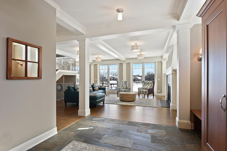
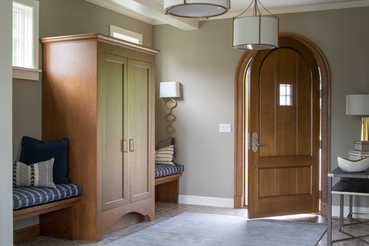
At the entrance of the home, we opted to reuse the built-in wood cabinets and benches, swapped out the dated tile flooring for a modern tile selection installed in a herringbone design, and upgraded the light fixtures.
ENTRANCE BEFORE:
ENTRANCE AFTER:
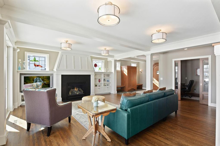
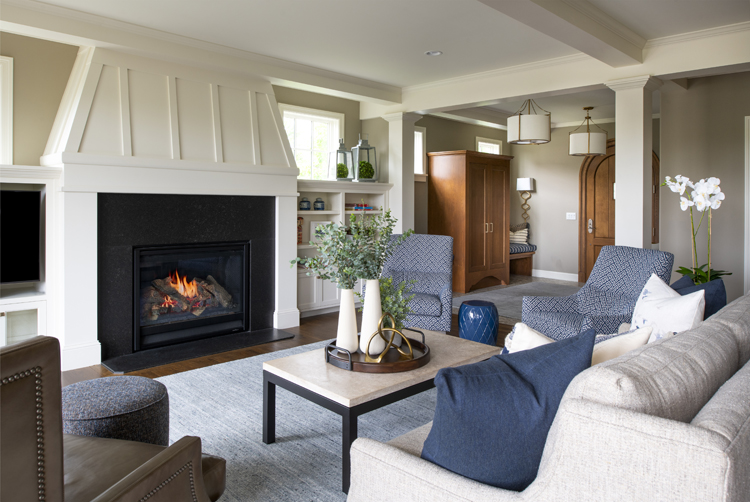
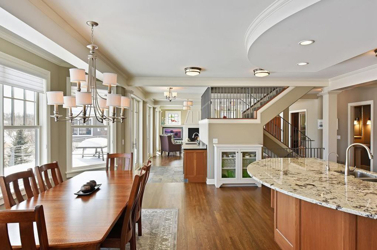
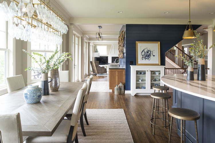
To create a modern and fresh look at the great room, we removed the existing light fixtures and added in recessed lighting, removed the stained-glass picture windows above the built-in media wall, and refinished the hardwood flooring. The updated great room is elegant while still comfortable and inviting.
GREAT ROOM BEFORE:
GREAT ROOM AFTER:
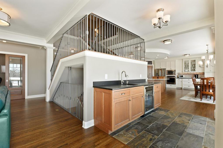
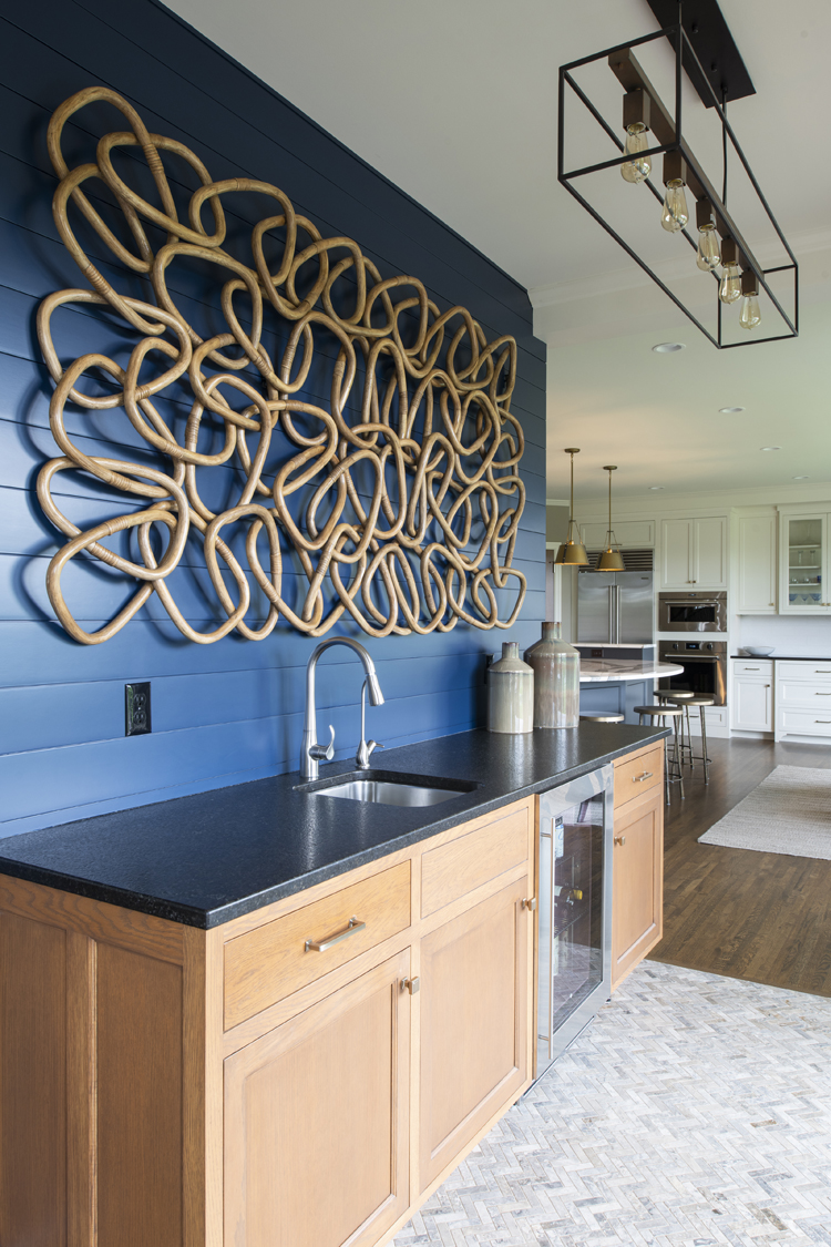
Due to the poor staircase design, noise easily traveled from lower level media room to the main and upper levels of the home. To address the noise issue, we removed the main floor railing surround above the bar area and at the great room and built-out walls in its place. The new shiplap walls were finished in the bold Sherwin Williams “Naval” paint. This statement color adds character and visual interest to the space. To make the remaining railing timeless in design, we updated the handrail to a stained wood.
STAIRCASE BEFORE:
STAIRCASE AFTER:
STAIRCASE BEFORE:
STAIRCASE AFTER:
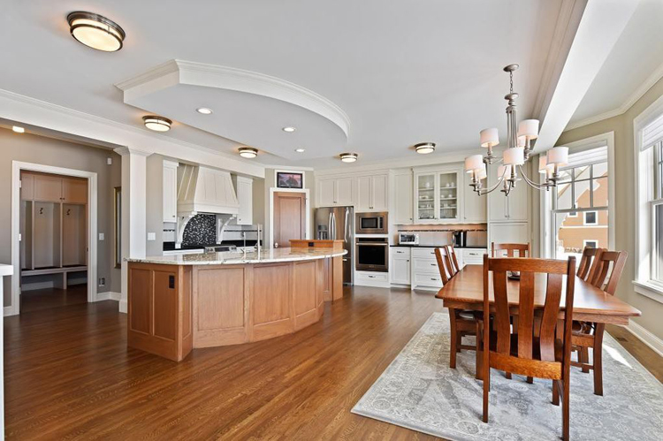
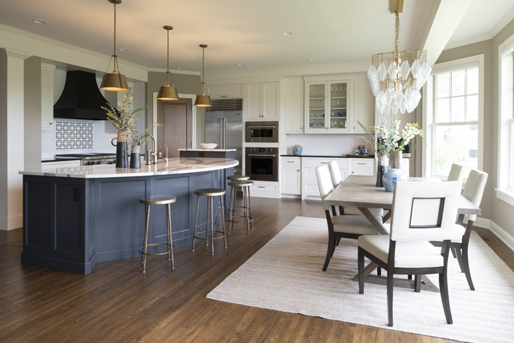
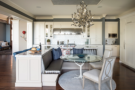
At the kitchen we completed a number of cosmetic updates. We kept the existing cabinetry but chose to stain the island cabinetry. We also upgraded the existing island top to a Cambria top in the Skara Brae finish. The updated kitchen features new backsplash tile, range accent tile, apron front sink, a striking range hood, and an updated ceiling design. The new gold light fixtures bring an element of glamour to the space.
KITCHEN BEFORE:
KITCHEN AFTER:
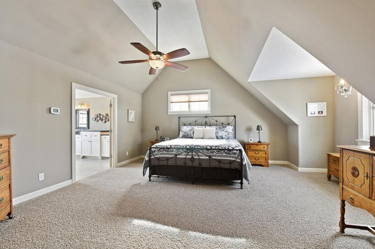
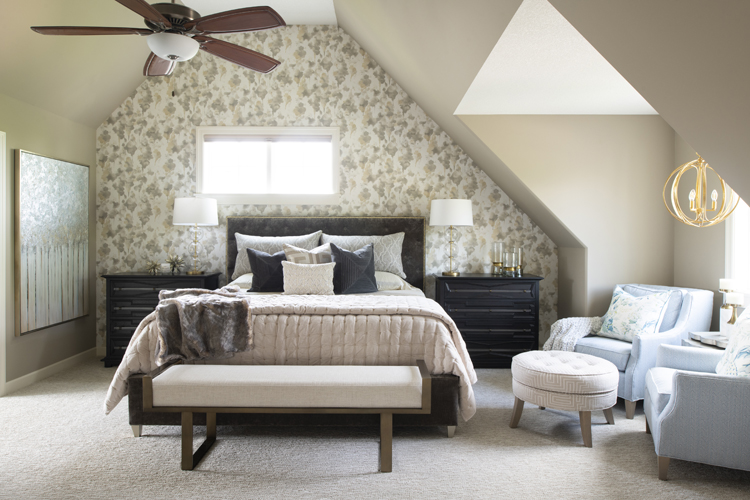
At the owner’s suite, we installed new carpeting, modern light fixtures, a beautiful wall covering, and updated the layout of the bathroom. We redesigned the shower at the master bath to improve the functionality within the space. The master bath features new, modern tile throughout.
OWNER'S SUITE BEFORE:
OWNER'S SUITE AFTER:
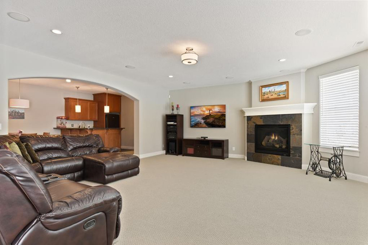
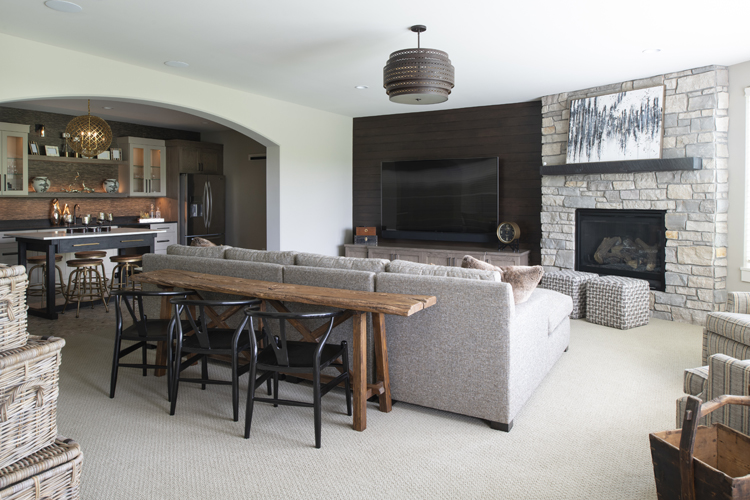
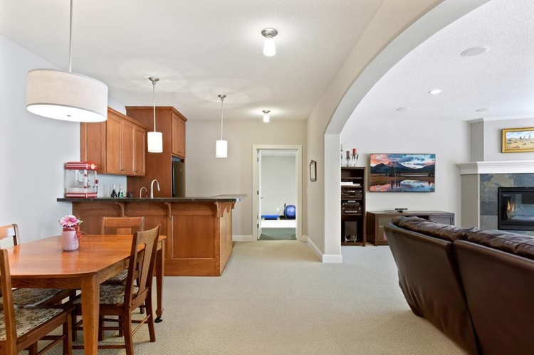
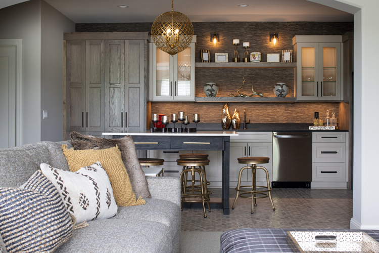
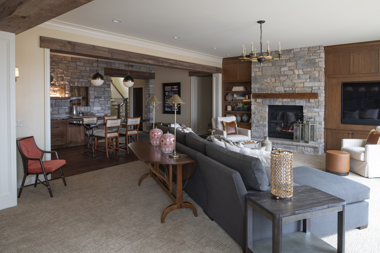
We completed a significant amount of work at the lower level of the home. The existing space lacked inspiration, functionality, and didn’t meet our owner’s needs or aesthetic. At the bar area, we removed the existing cabinetry and installed new custom cabinetry for all storage needs. We also removed the carpeting at this space and installed the same tile in the herringbone design that we utilized at the main level. The media room features an upgraded gas fireplace with a stone surround, new carpeting, and a shiplap accent wall with new media cabinetry. The space is perfect for hosting family and friends.
LOWER LEVEL BEFORE:
LOWER LEVEL AFTER:
LOWER LEVEL BEFORE:
Thoughtful use of color, glamorous accents, and a modern design transformed this home from dated to sophisticated, cozy, and inviting. View additional photos from this remodel here. Thank you to Studio M Interiors for partnering with us on this project!
‹ Back





Comments